
Views
Gallery
Objects as cards with a preview image and selected fields. The view for everything where the image matters: selection rounds, reviews, design decisions.
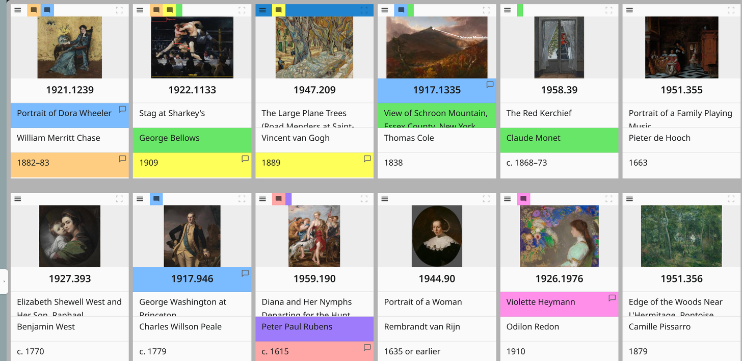
How a card is built
| Area | Content |
|---|---|
| Image | The first filled one of the chosen file fields. A geolocation field supplies its map preview here |
| Below it | The chosen text fields in the order you set |
| Left edge | Colour markings of the fields |
| Top right | Object menu (menu icon) |
| During a search | Hit counter; hovering shows a preview of the hits |
| When pinned | Blue bar along the top edge |
| While loading | A grey placeholder card until the object has loaded, see Large projects load in stages |
Which fields these are, and in which order, is set in the view settings ; you can change the order there by dragging.
A scroll rail stands at the right edge in place of the scroll bar: it shows the groups, periods, number ranges or initial letters of the sorting, and a click jumps there, see Scroll rail at the right edge .
Card density and width
| Setting | Effect |
|---|---|
| Compact | Less padding, smaller type. More cards per screen |
| Regular | More space, easier to read |
| Card width | Width of a card in pixels; decides how many fit into a row |
Both are global, not per project. In the global settings the density is called Compact cards and it applies to the gallery and the kanban together.
Click behaviour
Set in the global settings under Click on field (gallery):
| Setting | Effect |
|---|---|
| Open object | Default. Opens the object view |
| Copy content | Puts the field value on the clipboard |
| Edit field | Opens an editor for this field directly in the gallery |
| Do nothing | No click behaviour. Only the card frame opens the object |
Copy content is useful when you are typing values into another system, Edit field when you are working through one field across many objects.
Editing in the card
With the click behaviour Edit field, a click on a field value opens a floating input above the card. There you can set the value and also the colour marking and comment of this field.
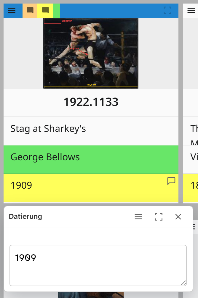
The editor uses the same input as the object view. A select list stays a select list, and a date field gets the calendar. The following cannot be edited:
- Subfields (address and object fields). They are edited through the base field.
- Split groupings (Split in the sorting), because they show only part of the value.
Object menu
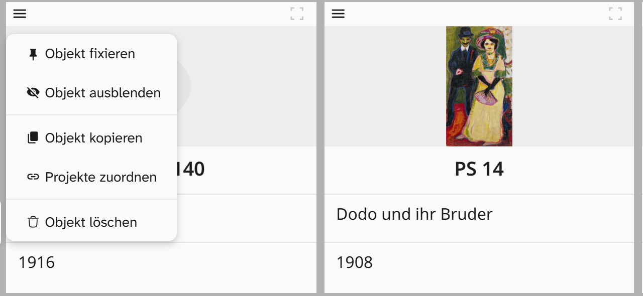
| Entry | Effect |
|---|---|
| Pin Object / Unpin Object | Keeps the object at the top of the selection. It stays visible even when filtering |
| Hide Object | Takes it out of the selection without changing the Wahl |
| Copy Object | Creates new objects with the field values. In the dialog: Number of copies and Link images in fields (images wont be copied) |
| Assign projects | The projects the object is in. See Linking an object to projects |
| Delete object / Restore object | Moves the object to the trash in this project or brings it back. Only with write access to the Wahl. See Deleting an object |
For many objects at once, the gallery has its own buttons: Pin all, Hide all not pinned, release n pinned objects, Show n hidden Objects and Limit selection to n pinned objects.
Dragging files onto cards
A file dragged onto a card ends up on that object after the upload. If you drop it over the image area, it is also placed in the image field. See Uploading files .
Further reading
- Setting up the gallery : the procedure
- Pinning and hiding
- View settings